GIF created using TimeManager plugin in QGIS and a custom Python script
From raw GPS files to interactive heatmaps and personal fitness analytics.

GIF created using TimeManager plugin in QGIS and a custom Python script
Skills:
Geospatial Data Processing (ETL) | Data Cleaning & Transformation | Spatial Data Analysis | Web Map Creation | Time-Series and Categorical Data Visualization | Shell Scripting for Automation | Modular Code Design & Reusability
Libraries & Tools:
Python | Pandas | GeoPandas | MatPlotLib | Folium | Git | GPXPY | QGIS | Jupyter Notebook
Project Description:
This project is a fully automated, end-to-end geospatial data pipeline built to process and visualize personal fitness activity data exported from Strava. It cleans, transforms, and analyzes raw activity files (including .fit, .gpx, and .csv), and outputs interactive heatmaps and geospatial datasets for web or GIS platforms like QGIS and ArcGIS Pro.
The pipeline extracts meaningful spatial insights from activity data, such as running and cycling routes, frequency, speed trends, and usage patterns over time. It culminates in two web-based heatmaps: one for general activity density and another with toggleable monthly layers for temporal analysis.
Additionally, the project includes exploratory data analysis scripts to track personal trends such as cumulative distance run per year, preferred running days, and speed trends over time using Matplotlib visualizations.
Key Features:
- Processed raw Strava activity files (.fit, .gpx, .csv) into usable geospatial formats
- Parsed GPS data into LineString and Point geometries using GeoPandas
- Exported clean GeoJSON datasets for use in GIS software (e.g., QGIS)
- Created interactive web-based heatmaps using Folium and Leaflet
- Developed temporal heatmaps with toggleable monthly layers for time-series spatial analysis
- Built custom Python visualizations for activity trends (distance, frequency, speed over time)
- Designed a modular, script-based ETL pipeline with optional Bash automation
Deliverables:
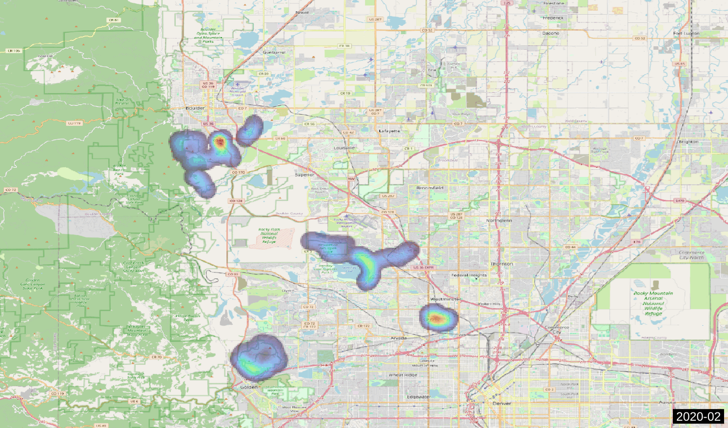
(1) Heatmaps: One representing the hotspots for the entire dataset, the other with toggleable months
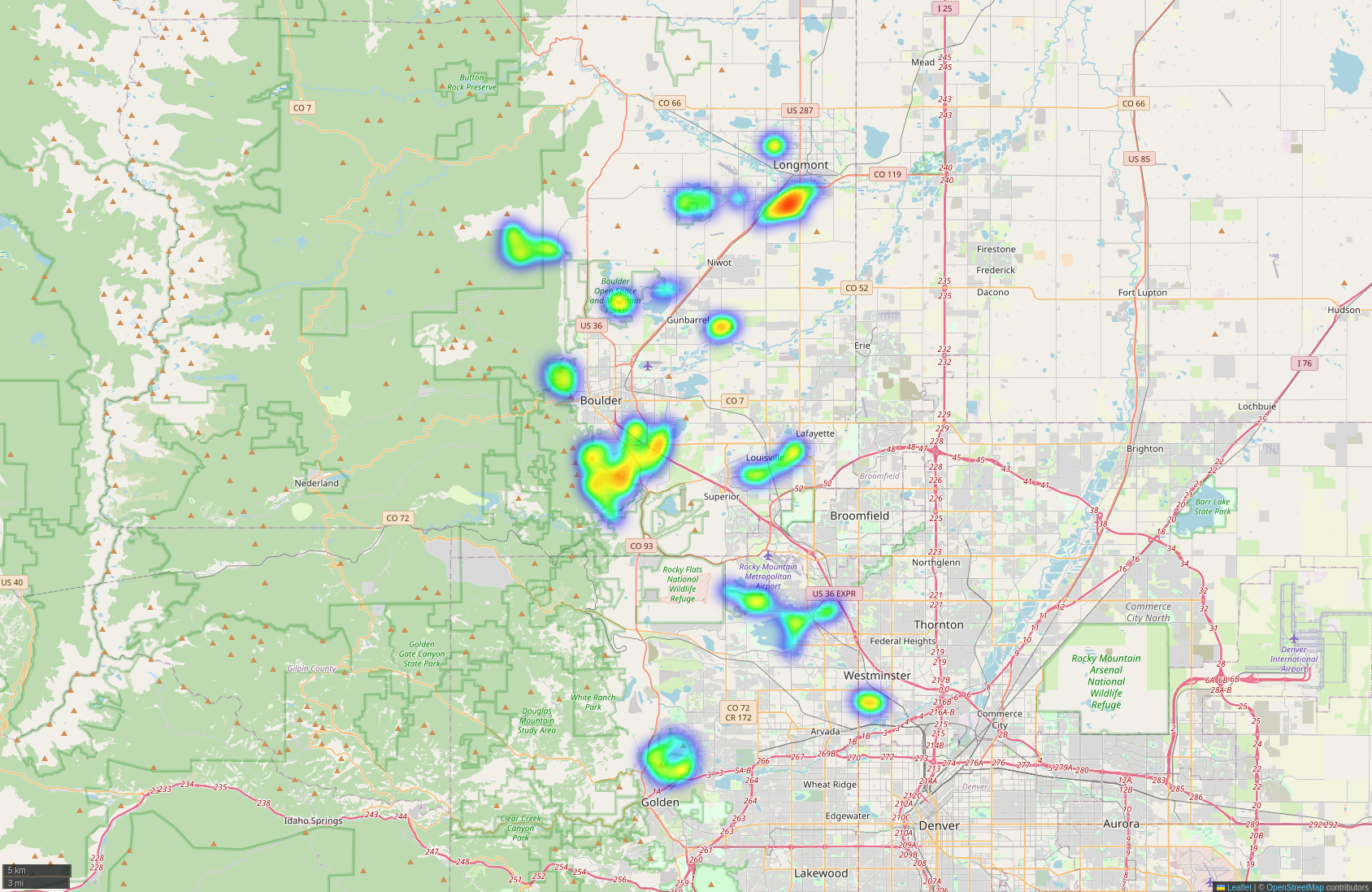
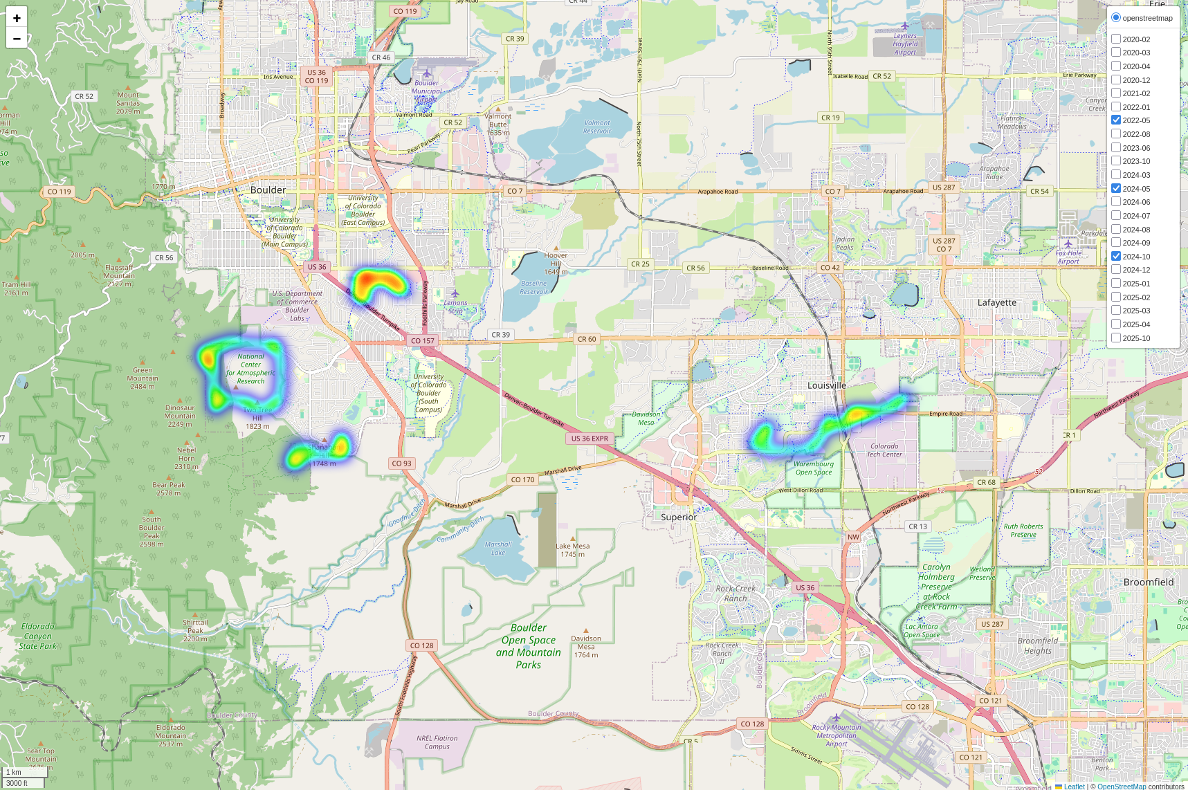
Click the images to open the respective interactive map
(2) Running Distance and Speed: Line plots showing yearly mileage progression and average monthly speeds

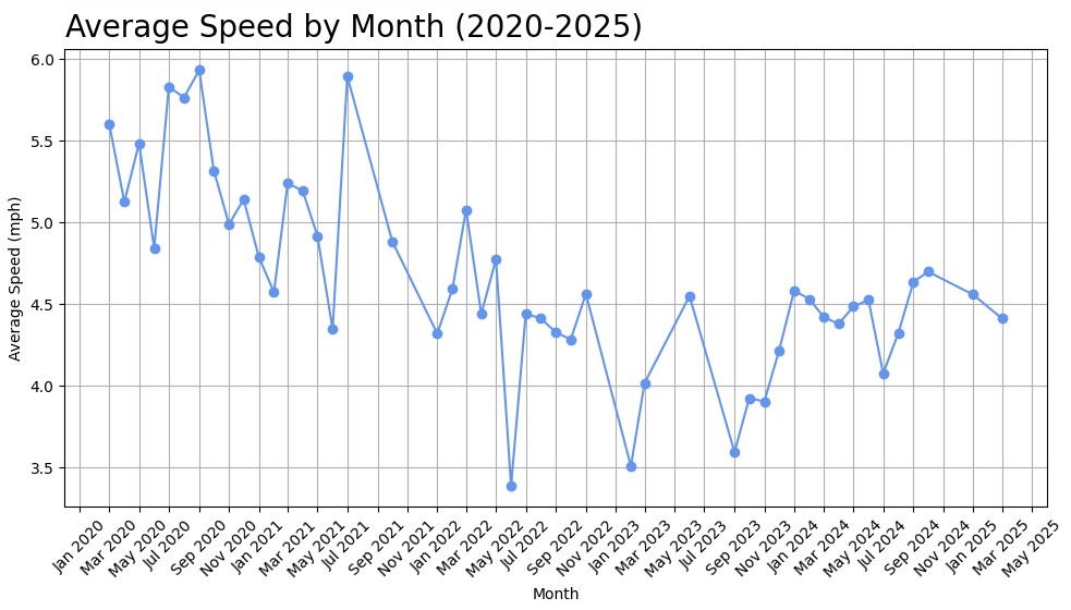
2020 saw the most miles run (likely due to COVID) and the highest speeds. Meanwhile, 2023 saw
some of the lowest mileage and most of the slowest runs
(3) Runs by Day of the Week: Bar chart revealing preferred running days
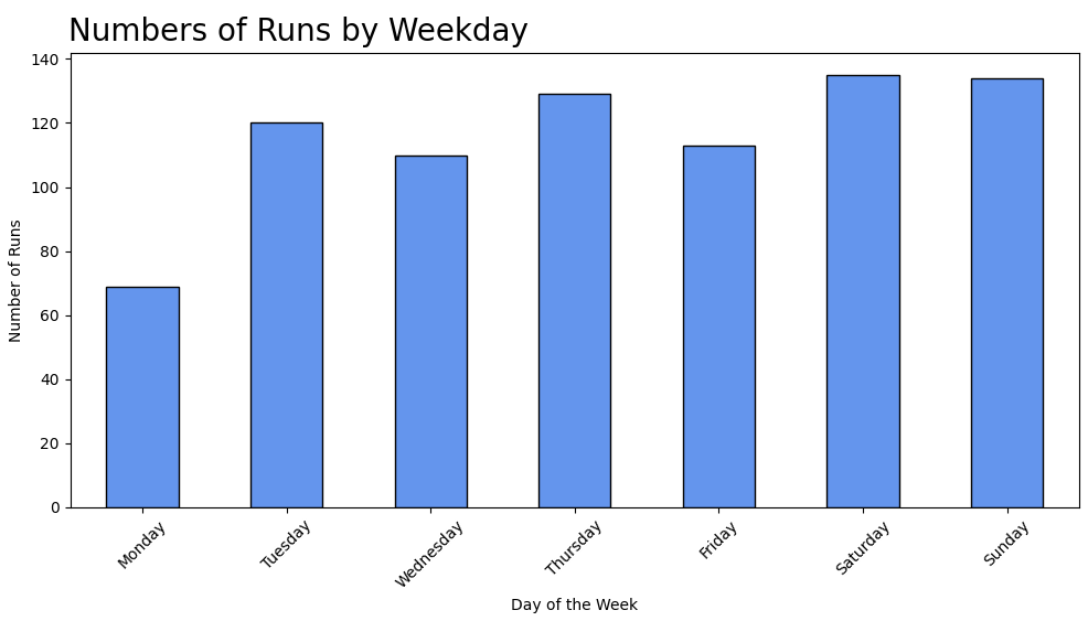
Like Garfield, I don't seem to like Mondays
Potential Use Cases:
- Analyze personal or community fitness activity spatially
- Identify high-traffic or popular activity corridors
- Visualize activity patterns by time (e.g., seasonal changes)
- Integrate with other spatial tools like QGIS or PostGIS
Future Improvements:
- Store processed data in a PostGIS or SQLite spatial database
- Add automated scheduling with cron or Airflow
- Implement unit tests and logging for improved reliability
CHaagFernandez@protonmail.com

